What is Dollarlogic Charts?
Dollarlogic Charts is a massive undertaking representing 1,000s of hours of searching, curating, and creating informative and useful charts. Soon they will be available as a complete purchase.
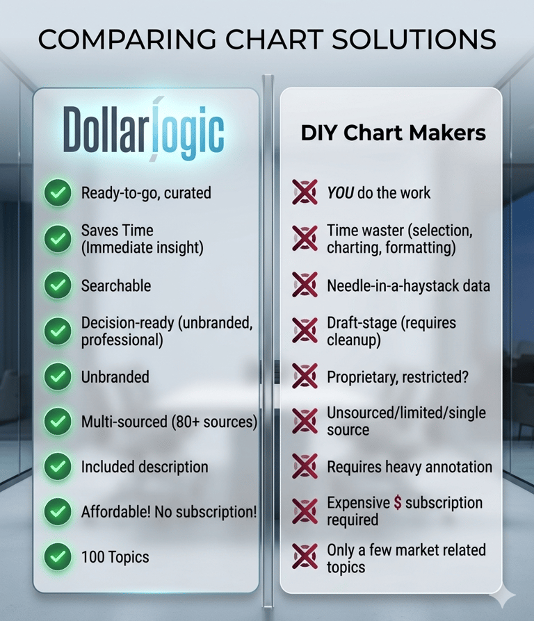
Why Dollarlogic Charts?
1) Quick, useful, readable charts
2) NOT DIY! You don’t have to make the chart
3) Quarterly updates plus historical/vintage data, we add about 100/month
4) Widest topic categories available
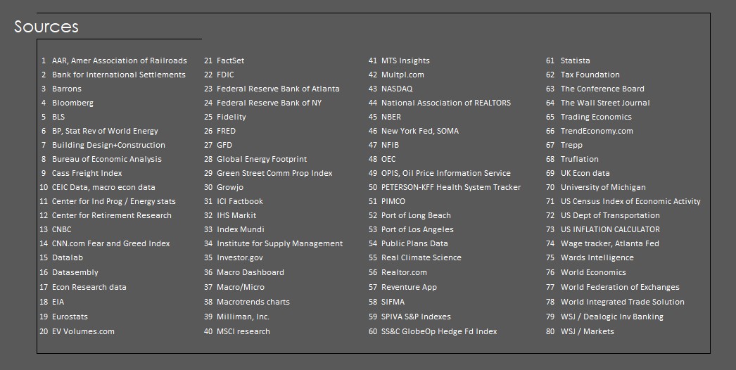
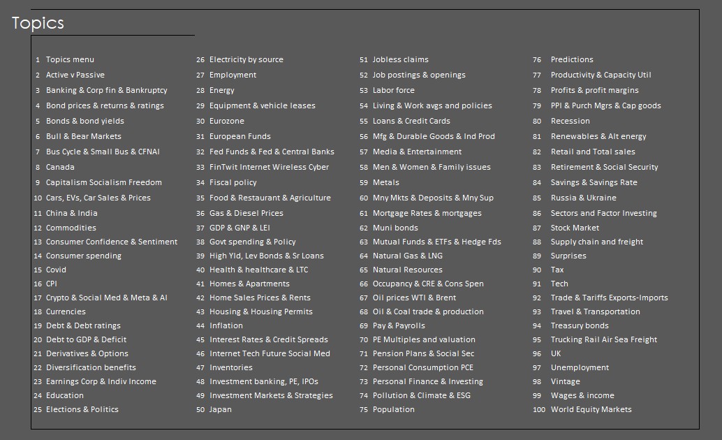
5) 10 categories, 100 Topics, 80 sources, 2,400+ charts (add 100, month)
6) Unbranded
7) Save research time, fact check others, predict recessions
8) Curated, quality, relevant, ready to go content
9) Actionable data with accurate definitions
10) Laugh at how wrong predictions were--win arguments

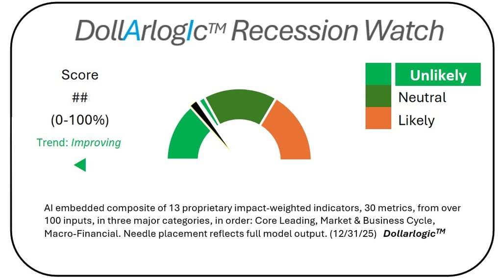
Dollarlogic Recession Watch:
1) DEPTH – Starting universe data points
Data search funnels from the widest accumulation of research available among 100+ input factors.
2) AUTHORITATIVE – 80 Sources
Base sources are identified, scrubbed, multi-validated, and disclosed for every input factor.
3) FOCUSED – Curated to 30 selected metrics
Data is then sorted to 30 selected metrics each known to be leading business cycle indicators.
4) COMPREHENSIVE REVIEW – Data scrub
Each metric, evaluated through a proprietary algo-synthesis of AI and Dollarlogic Charts assessment.
5) OPTIMIZED – Compilation into one percentage score
30 scores are aggregated into thirteen recession indicators in three categories-rolls up to a single value between 1-100% (Unlikely-Neutral-Likely).
6) DEFINITIVE READING – Result
% probability score is recorded on the Dollarlogic Recession Watch gauge.